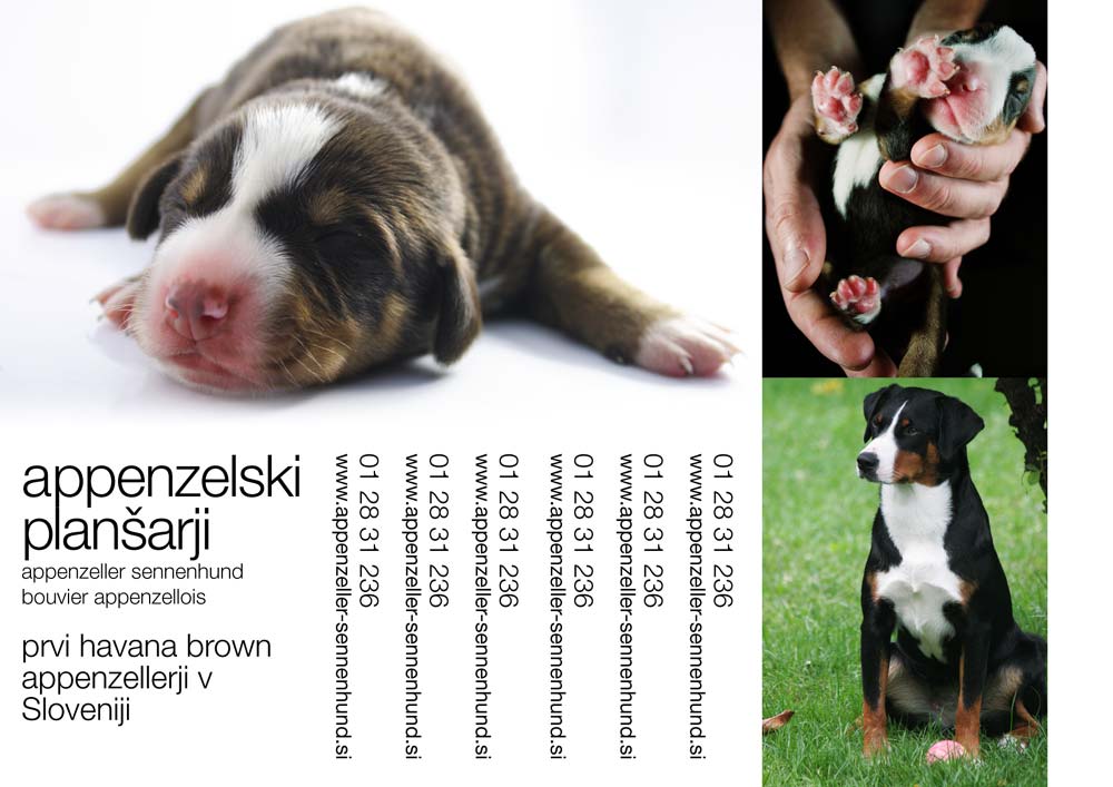
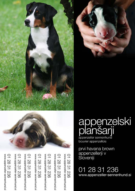
The print campaign
July 25th, 2007  Comments(1)
Comments(1) Below you’ll find ads for the “print campaign” targeting pet stores and the like. Two similar ideas, I preffer the white-on-black text however it doesn’t work well in print since ink spills over as paper absorbs it thus severely limiting text legibility. Of course it would be better, even completely eliminated, with a different kind of paper but I just don’t want to complicate matters more than they already are.
Incidentally… ink absorbtion in high speed printing on low quality paper for newspapers and such is dealt with using ink traps. Learn more in the article by Nick Sherman – Bell Centenial Form & Function


Actually the black on white is quite beautiful and eye-catching. Good luck with the campaign!
*
You know, on first glance I thought this was a calendar. I think the images would make a beautiful calendar if you wanted to get into that business….I think you can do it on cafepress.com if you wanted to.