Helvetica posters
July 30th, 2007  Comments(0)
Comments(0)
Keeping up with the type related items today… found another gem through Design Observer. It’s another collection, this time posters, celebrating 50 years of Helvetica.
Comments(0)
Keeping up with the type related items today… found another gem through Design Observer. It’s another collection, this time posters, celebrating 50 years of Helvetica.
Comments(0)
By Vancouver Film School students Ryan Uhrich and Marcos Ceravolo.They sure had a bit of inspiration from What Does Marsellus Wallace Look Like?
Comments(1)
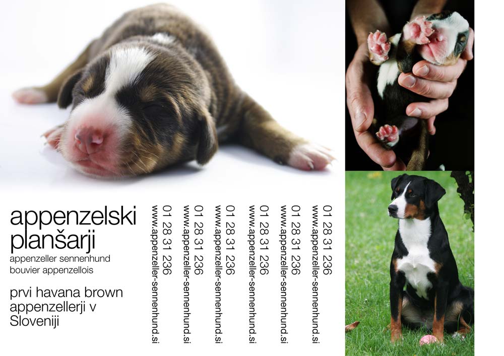
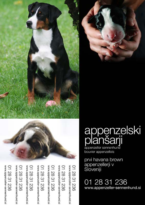
Below you’ll find ads for the “print campaign” targeting pet stores and the like. Two similar ideas, I preffer the white-on-black text however it doesn’t work well in print since ink spills over as paper absorbs it thus severely limiting text legibility. Of course it would be better, even completely eliminated, with a different kind of paper but I just don’t want to complicate matters more than they already are.
Incidentally… ink absorbtion in high speed printing on low quality paper for newspapers and such is dealt with using ink traps. Learn more in the article by Nick Sherman – Bell Centenial Form & Function


